Note
Go to the end to download the full example code.
Inject a known signal into a TimeSeries#
It can often be useful to add some known signal to an inherently random or noisy timeseries. For example, one might want to examine what would happen if a binary black hole merger signal occured at or near the time of a glitch. In LIGO data analysis, this procedure is referred to as an injection.
In the example below, we will create a stream of random, white Gaussian noise, then inject a simulation of GW150914 into it at a known time.
First, we prepare 32-seconds of Gaussian noise:
from numpy import random
from gwpy.timeseries import TimeSeries
rng = random.default_rng(0)
noise = TimeSeries(rng.normal(scale=2, size=32 * 16384), sample_rate=16384)
Then we can download a simulation of the GW150914 signal from GWOSC:
url = "https://gwosc.org/s/events/GW150914/P150914/fig2-unfiltered-waveform-H.txt"
signal = TimeSeries.read(url, format="txt")
signal.t0 = 16
Note, since this simulation cuts off before a certain time, it is
important to taper its ends to zero to avoid ringing artifacts.
We can accomplish this using the
taper() method.
signal = signal.taper()
Since the time samples overlap, we can inject this into our noise data
using inject():
data = noise.inject(signal)
Finally, we can visualize the full process in the time domain:
from gwpy.plot import Plot
plot = Plot(noise, signal, data, separate=True, sharex=True, sharey=True)
for ax, text in [
    (plot.axes[0], "Noise only"),
    (plot.axes[1], "Signal only"),
    (plot.axes[2], "Noise + signal"),
]:
    ax.text(
        0.01, .92, text,
        transform=ax.transAxes, ha="left", va="top",
        bbox={"facecolor": "white", "alpha": 0.8},
    )
ax1 = plot.axes[1]
ax1.set_ylabel("Amplitude")
ax1.set_epoch(0)
axins = ax1.inset_axes(
    [0.7, 0.4, 0.29, 0.55],
    xlim=(15.95, 16.25),
    ylim=(-2, 2),
    xticklabels=[],
    yticklabels=[],
)
axins.plot(signal)
ax1.indicate_inset_zoom(axins, edgecolor="black")
plot.show()
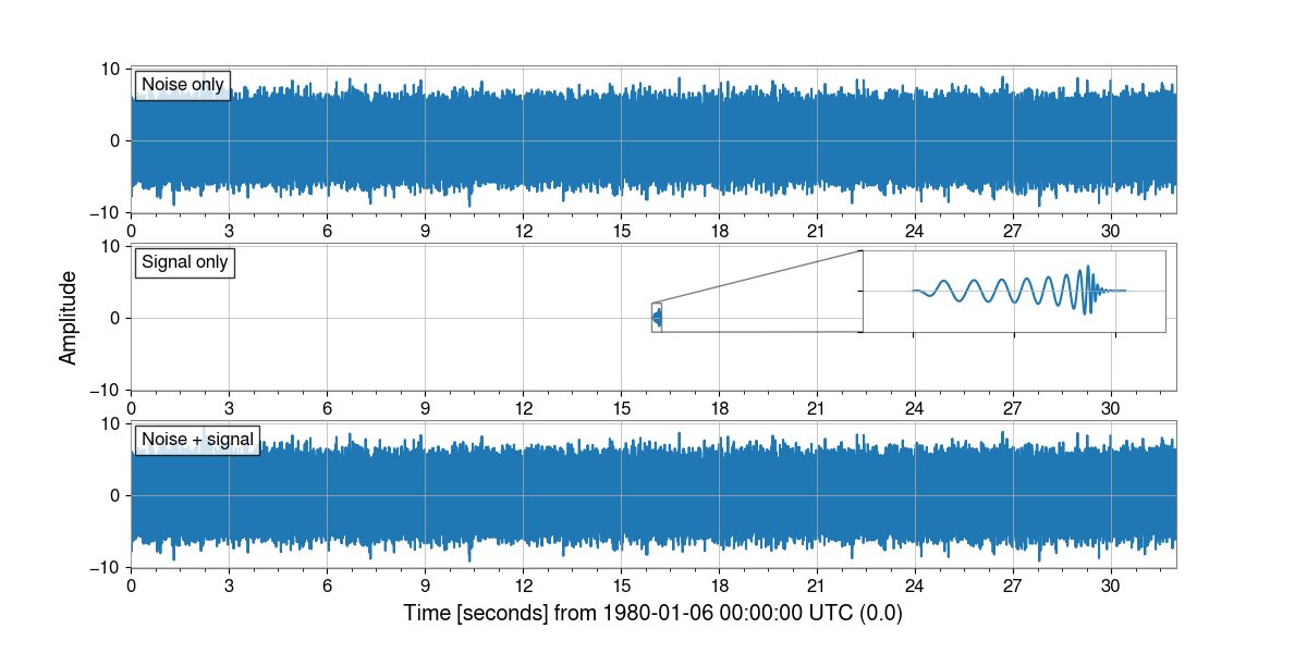
Given the difference in amplitude, we can’t see the injected signal in the noisy data at all. However, we can use the Q-transform to visualize things in the time-frequency domain:
outseg = (15.4, 16.4)
noiseq = noise.q_transform(outseg=outseg, fftlength=4)
dataq = data.q_transform(outseg=outseg, fftlength=4)
plot = Plot(
    noiseq,
    dataq,
    method="pcolormesh",
    separate=True,
    sharex=True,
    sharey=True,
    clim=(0, 25),
    yscale="log",
    ylim=(16, 1000),
)
for ax, text in [
    (plot.axes[0], "Noise only"),
    (plot.axes[1], "With injected signal"),
]:
    ax.text(
        0.01, .95, text,
        transform=ax.transAxes, ha="left", va="top",
        bbox={"facecolor": "white", "alpha": 0.8},
    )
plot.colorbar(label="Normalized Energy")
plot.show()
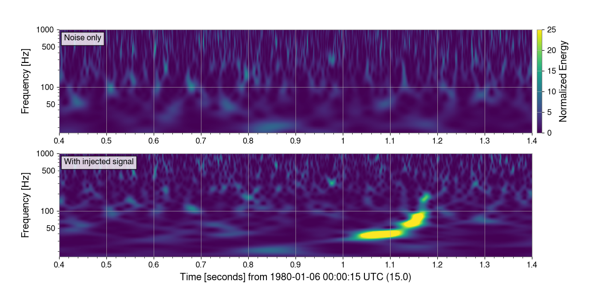
Here, we can clearly see the injected signal in the Q-transform of the data.
For more information on the Q-transform, see Generate the Q-transform of a TimeSeries.
Total running time of the script: (0 minutes 9.631 seconds)