Tabular data examples#
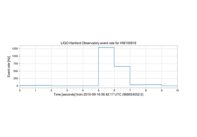
Calculating (and plotting) rate versus time for an EventTable
Calculating (and plotting) rate versus time for an EventTable
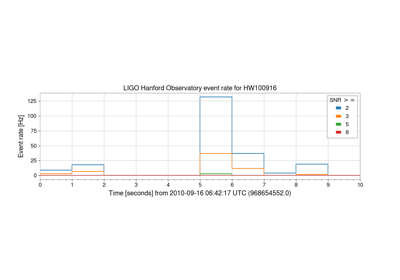
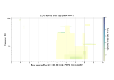
Plotting EventTable rate versus time for specific column bins
Plotting EventTable rate versus time for specific column bins